Weeknotes 07/07/2023
Big (quiet) Monday
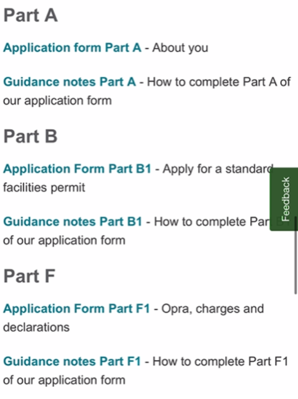
After months (and in some cases years) of work, around 50 pages and 26 forms quietly went live in the early hours of Monday morning.
Despite an ‘automated schedule’ feature to make pages live on the website, it was an early start for some of our team, who diligently worked through a long list of post-go-live tasks.
Waste permit applications
From 3 July, users can now apply online to:
- apply for a new waste permit
- change their waste permit
- transfer or give up their waste permit
Previously, to apply for a new standard rules waste permit, applicants had to download and complete three Word forms and read three documents on how to complete the forms.
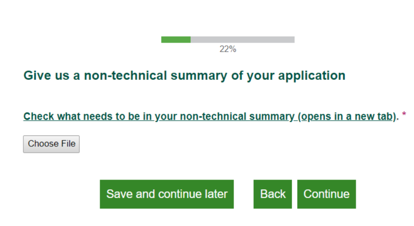
Now – provided a user has prepared the information we need – they can apply online, on their phone if they want to, in just a few minutes.
If users haven’t prepared the information we need, the form gives them the opportunity to check the requirements as they work through the form.
Users are sent to a confirmation page at the end of the application telling them what happens next and receive a copy of their application by email.
Resourceful with the tools we have
We don’t have our design system to work with – no access to components like GDS’s ‘task list’ which work well for more complicated applications like this. So, this work has really stretched us to make the most of the tools we have: Smart Survey and our Umbraco CMS.
We’ve followed GDS’ design system patterns as much as possible for the start and termination pages, and best practice on form building (one thing per page).
We have added a BETA message to the start and confirmation pages soon to collect some initial feedback, and users who are willing to work more with us on iterations.
.png?raw=true)
Next steps
It’s been an opportunity to be bold and demonstrate what we can do as a team, with the support of some great colleagues who trusted us to do things differently.
It’s now important for us to:
- Reflect and learn what went well (and not so well)
- Look at where we can continue from here
- Gather feedback from service users and colleagues
- Talk about what we did, the difference it’s making for service users and colleagues
- Share the outcomes with senior leaders
An interview with AI…
This week, Sophie and Heledd have done something a little different and consulted the almighty AI that is Chat GPT for an interview about alt-text.
Having been inspired by an interesting article by Content Design London, we were keen to explore AI solutions to help us simplify things, and the responses we received were insightful considering it came from a robot!
“So, what is alt-text?”
[Alt-text, short for alternative text, is a textual description that is added to an image on a website or in a document. It serves as a substitute for the image when it cannot be displayed or accessed by the user, such as for individuals with visual impairments or when images fail to load.]
“Are there any do’s and don’ts of writing alt-text that people should be aware of?”
[Remember, alt-text is crucial for web accessibility and ensures that individuals who cannot see images can still comprehend the information being conveyed. Follow these guidelines to create alt-text that enhances the accessibility and usability of your content.]
Here are some do’s and don’ts to consider when writing alt-text:
Do’s:
-
Be descriptive - Provide a concise and accurate description of the image, focusing on its content and purpose. Describe key visual elements, such as objects, people, and relevant context.
-
Be concise - Keep alt-text brief and to the point, aiming for a few words or a short sentence. Avoid lengthy descriptions that may overwhelm the user.
-
Be relevant - Ensure that the alt-text is relevant to the surrounding content and provides meaningful information. Consider the image’s role in the context of the web page or document.
-
Be informative - Use alt-text to convey important information or convey the intended message of the image. Include details that are essential for understanding the image’s purpose.
-
Be mindful of context - Consider how the alt-text interacts with the rest of the content on the page. Ensure that it complements the surrounding text and provides a cohesive reading experience.
Don’ts:
-
Don’t use “image of” or “picture of” - Avoid starting the alt-text with generic phrases like “image of” or “picture of” as it adds no value and wastes valuable character space.
-
Don’t use unnecessary details - While it’s important to be descriptive, avoid including irrelevant or superfluous information. Focus on the most pertinent aspects of the image.
-
Don’t use overly technical language - Use clear and simple language in alt-text, avoiding jargon or complex terms that may be difficult for some users to understand.
-
Don’t use decorative language - Alt-text should not be used to convey subjective interpretations or opinions about the image. Stick to objective descriptions instead.
-
Don’t leave alt-text blank - Always provide alt-text for meaningful images. Leaving it blank can make it difficult or impossible for users who rely on alternative text to understand the content.
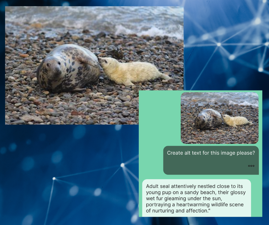
Heledd was curious as to whether AI could help us come up with alt-text, so she downloaded a free trial of AI Smith for iPhone and the results were interesting.

The alt-text we received was:
[Adult seal attentively nestled close to its young pup on a sandy beach, their glossy wet fur gleaming under the sun, portraying a heart-warming wildlife scene of nurturing and affection.]
This description, while a good first attempt, would not pass as alt-text for several reasons:
-
Too much unnecessary detail - someone using a screen reader does not need to know that the seal’s glossy wet fur is gleaming under the sun.
-
Subjective information - While a mother and her baby does depict a heart-warming scene of nurturing and affection - simply saying a mother seal and her pup is plenty of information.
-
Not very concise - alt-text should be brief and to the point, aiming for a few words or a short sentence, so as not to overwhelm a user accessing the content via a screen-reader.
A better example of alt-text for the seal image could look like:
A mother seal and her pup sit on the shore of a pebbly beach.
Verdict: a review by a human is still essential
Despite these limitations, there is an opportunity for AI to support people in writing their alt-text. So long as you allocate time to carefully review the information contained in the alt-text as it tends to go overboard when describing images. AI is after all smarter than the average human!
The general rule is that alt-text needs to be written by humans, for humans… But if you’re accepting help from AI, we recommend careful reviewing by a human being too.
There’s also a feeling that it may be quicker to write and think for yourself….
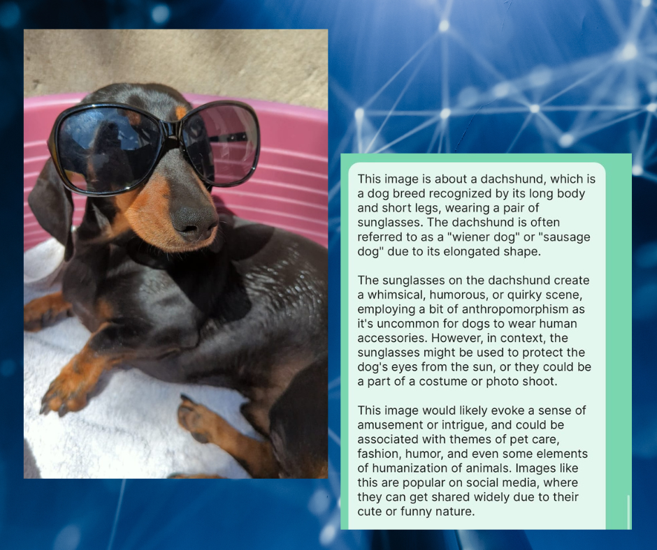
Finally, we decided to try a funny picture to see if AI could work out what this image contains. Again, the alt-text provided was too long and overly descriptive, however it did identify the picture well.

The alt-text we received was:
[This image is about a dachshund, which is a dog breed recognized by its long body and short legs, wearing a pair of sunglasses. The dachshund is often referred to as a “wiener dog” or “sausage dog” due to its elongated shape.
The sunglasses on the dachshund create a whimsical, humorous, or quirky scene, employing a bit of anthropomorphism as it’s uncommon for dogs to wear human accessories. However, in context, the sunglasses might be used to protect the dog’s eyes from the sun, or they could be a part of a costume or photo shoot.
This image would likely evoke a sense of amusement or intrigue, and could be associated with themes of pet care, fashion, humour, and even some elements of humanization of animals. Images like this are popular on social media, where they can get shared widely due to their cute or funny nature.]
With a few amends, this can be made into a better alt-text example, please see below:
A dachshund dog is wearing a pair of sunglasses on a sunny day.
To brush up on your knowledge of alt-text and all things accessibility, please see our guidance for writing accessible documents and let us know if you have any questions.
Other things we’ve been working on:
-
Lucinda has been giving SmartSurvey feedback on the custom form theme they are building for us with resident superhero Owain accessibility testing this with a screen reader - a super team!
-
James and Heledd joined the Customer Experience Practitioner Network on Thursday. They heard updates about the work programme and raised some concerns about the value of customer satisfaction surveys for improving user experience.
-
Sam, Lucinda and Laura are planning an in-person meeting in Cardiff to work on the ‘Apply to use the land we manage’ service in August.
-
Lucinda has also been interviewing some internal users as part of the service design in practice course.
-
Heledd joined Christine (from Crocstar) in writing for the web training session - focussed on blogs.
-
Paul and Alex have started to formulate a new plan for helping us with prioritising and tracking some of the bigger pieces of work we have and opportunities for future work. They’ve started to review our multiple work planners and Mural boards and will soon start to share ideas and questions.

